What the hell is Jeff Barson doing?

Subscribe: img-rss.gif  ATOM / RSS

Where am I?

This is the blog of Jeff Barson. I'm currently running HireVue Labs, former Director at Sendside, founder of Surface Medical, Nimble, Medspa MD, Freelance MD, Frontdesk, Uncommon, and Wild Blue... angel investor and startup advisor. Oh, and I'm a artist. More >>

Thoughtstream

Constant Dispatches

    Follow me on Twitter

    Blog Stuff

    Kiva - loans that change lives

    About   l   Login
    "Everyone wants to kill the king. But the prince, he just sails along telling all the ladies, 'One day I'm gonna be king.'" ~
    Vince Chase, Entourage

    Entries in User Experience (3)

    Friday
    Oct302009

    Designing User Experiences for Social Traction

    Designing user experiences.

    Take a look at this post from one of the founders of Posterous on how they designed their user experiences to start with interaction and only then move on to account creation:


    Being able to post to Posterous without an account was something we designed for from day one, even before the name "Posterous" existed. I didn't want there to be hurdles like registration forms and email confirmations for new users.


    Emailing to Posterous without an account is actually great for us in a couple different ways. First is the typical "try before you buy" scenario. It makes more sense for a user to *use* the service and see how great it is, before we ask them to sign up. But obviously, most of our users do eventually sign up to get access to all our advanced features.


    But sign-up free posting is also great for group sites. When you setup a group Posterous site, you add contributors by adding their email address in site settings. Those people can now email post@sitename.posterous.com with no account. We do see these people engage with Posterous in the long term with no account, especially users who aren't tech savvy.

    Using Posterous without an account isn't just some gimmick we did with email, it's something we believe in through and through. Registrations forms and other hurdles slow down adoption. We want to prove to you how valuable our service is *before* we ask you to sign up. That's why we allow this flow not just through email, but through our Twitter posting API and even our iPhone application.

    Tuesday
    Oct132009

    Design. Usability. Experience.

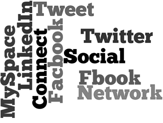
    I've been harping on design, usability and experience for longer than I care to admit. Here's some info from a CNN story on the divide between users of social networks extends through income;

    A recent study found that people in more affluent demographics are 25 percent more likely to be found friending on Facebook, while the less affluent are 37 percent more likely to connect on MySpace. The wealthiest users, however, are on LinkedIn

    Users with household income above $75,000
    Facebook -- 41.74 percent
    MySpace -- 32.38 percent
    LinkedIn -- 58.35 percent
    Twitter -- 43.34 percent

    MySpace, on the other hand, had a "come one, come all" policy and made a mad dash towards monetization, Ostrow said. "They used a lot of banner ads without regard to the quality, and it really diminished the value [of the site] for the more tech-savvy demographic."

    So which social networks provide the most value and have the highest potential for revenue? It's never going to be MySpace, that boat has sailed.

    LinkedIn and Twitter are delivering on their promise to the greatest extent... largely because they're both constrained in what they are designed to do. Twitter as a 'what's happening right now' and LinkedIn as a business network.

    Facebook has a harder time of it. Fbook's huge user base is such a conglomeration that it's difficult to find a real niche that Facebook can attack other than 'everyone's connected to everyone else'.

    Here's my ratings for Design, Usability, and User Experience for the big four:

    Design: 

    Facebook -- B- Decent, but the addition of so many applications on user pages makes for a cluttered experience.
    MySpace -- D Terrible UI and even worse design. The only reason I can't actually fail MySpace is that they acually have millions of users.
    LinkedIn -- B Again, like Facebook, a decent UI. It's always difficult to keep large data-sets distinct while maintaining usability.
    Twitter -- A- Simple and clean.

    Usability: 

    Facebook -- C The default page is clean but that falls apart on individual pages.
    MySpace -- C Myspace gets a C since it's proven that even MySpace users can eventually navigate the site.
    LinkedIn -- B Better get in before they really start with the monitization.
    Twitter -- B+ Leading the pack since there are so few options. Simple = usibility.

    User Experience: 

    Facebook -- B This is where there's a split. Facebook's need for content generation starts to saturate it's usefullness as any real communication tool.
    MySpace -- C Last place again. Seems like a state fair game.
    LinkedIn -- B+ Tied for first. LinkedIn doesn't get heavy until you're an experienced user.
    Twitter -- B+ Tied for first. Simple means that Twitter is easy. (Unless you're following a crowd.)

    Monday
    Mar232009

    Google Design (or lack thereof)

    "When a company is filled with engineers, it turns to engineering to solve problems."

    Google's lead designer is leaving. When I first heard this I thought... "Google has a designer?"

    Indeed they do, or did. (I"m sure they still have pleanty of designers.) But, their lead diesigner is leaving and has posted something I didn't expect from anyone associated with Google and design, a thoughful post on how anyaytics and performance based testing can strip away both the aesthetics and the humany from an interface.

    Reduce each decision to a simple logic problem. Remove all subjectivity and just look at the data. Data in your favor? Ok, launch it. Data shows negative effects? Back to the drawing board. And that data eventually becomes a crutch for every decision, paralyzing the company and preventing it from making any daring design decisions.

    Yes, it’s true that a team at Google couldn’t decide between two blues, so they’re testing 41 shades between each blue to see which one performs better. I had a recent debate over whether a border should be 3, 4 or 5 pixels wide, and was asked to prove my case. I can’t operate in an environment like that. I’ve grown tired of debating such minuscule design decisions. There are more exciting design problems in this world to tackle.

    I can’t fault Google for this reliance on data. And I can’t exactly point to financial failure or a shrinking number of users to prove it has done anything wrong. Billions of shareholder dollars are at stake. The company has millions of users around the world to please. That’s no easy task. Google has momentum, and its leadership found a path that works very well. When I joined, I thought there was potential to help the company change course in its design direction. But I learned that Google had set its course long before I arrived. Google was a massive aircraft carrier, and I was just a small dinghy trying to push it a few degrees North.

    So true it makes me wonder how the guy survived as long as he did. The amazing success that Google has shown has been without any aesthetic that's recognizable at all. Two things are for sure; Google is not Apple, and when a company is ruled by engineers, it turns to engineering to solve problems.